Bill Dot
Bill Management Mobile App
Table of Contents
Role: UI/UX Researcher & Designer
Tools: FigJam, Figma, Android Material Design, Apple Human Interface Guidelines
Summary: I designed a mobile app that provides a convenient way to keep track of various bills, and reminder notifications to ensure on-time payments. I created two mockup sets for Android and iOS operating systems to provide a widely accessible and consistent app experience for all users.
Project Background
Bill Dot is a mobile bills management app that will help users to conveniently keep track of bills and receive reminders on hand. This app is made native to both Android and iOS to reach more users and ensure they all enjoy a pixel perfect design. This app was designed for a CareerFoundry UI Design bootcamp project.
Identifying the Problem
Billing management features are often hidden in personal finance apps, lost in the overwhelming number of functions available: banking, investments, credit cards, payments, subscriptions, and more. Users often do not find the billing features convenient enough to use, if they can find them at all.
Finding a Solution
Bill Dot provides users an easy, direct way to track bill status and set payment reminders. By focusing on these functions in a separate mobile app, users will be more likely to utilize the app’s bill status tracking & reminder tools to make more payments on time and reduce financial stress.
Competitive Analysis
I conducted a competitive analysis of the personal finance apps Chronicle, Bill Organizer, and Mint to get an idea of what design patterns and workflows will be familiar to users, and to assess the strengths and weaknesses of existing personal finance apps.


Synthesized Assessment
Strengths
Provides efficient overview of info
Quick identification color markers
Clear physical grouping of bills by month/status
Weaknesses
Unclear text hierarchy
Some formatting does not visually flow, spacing feels unbalanced
Colors clash or interfere flow of hierarchy
User Flows
I mapped out a user flow to organize what functions I would need for users to manage bill entries and customize app settings. Outlining these informed my wireframing and prototyping.

Mid-fi Wireframes
I created low/mid-fidelity wireframes to roughly visualize the screens required for each of the user flow paths.

Style Guide
Typography
Following both the Android Materials Design and the Apple Human Interface Guidelines, I decided to use the standard fonts for each operating system: Roboto in Android, SF Pro in iOS. These clean, easy to read fonts will allow users to comfortably and accurately read important financial information.
Color Palette
I built the app’s color palette with accessible color combinations that would give a calming effect while also remaining legible and easily identifiable.

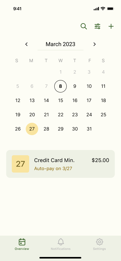
Final Mockups
I applied the above styles to my wireframes to make my two sets of final mockups, one for each operating system. They both use the same color palette, but have customized spacing, alignments, and UI elements to ensure a pixel perfect design for a wider pool of users and their devices.
Android


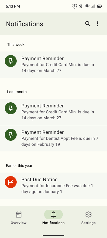

iOS