Next Recipe
Recipe Responsive Web App
Table of Contents
Role: UI/UX Researcher & Designer
Tools: FigJam, Figma, Usability Hub
Summary: I designed a responsive mobile web app for online recipes that are efficient to access and easy to follow. I conducted user research through user interviews and user personas, and mapped user flows to target user needs. These guided the wireframing which I prototyped to conduct usability testing. I also created various graphic UI elements and presentation mockups.
Project Background
Next Recipe is a responsive web app to be used on smartphone, tablet, and computer devices for users who are looking to find recipes online. This app was designed as a project for CareerFoundry’s UI Design bootcamp.
Identifying the Problem
Many recipe web apps available today are cluttered with content and confusing to navigate. Recipes are saved and then left untouched, lost in a graveyard of saved pages that take too long to scroll through, leaving users frustrated even before starting a recipe.
Finding a Solution
Next Recipe is designed to provide efficient navigation and an inviting interface. It also includes functions for users to save recipes and organize them into collections for easier access. Recipes are tagged by various categories for quicker searches.
User Research
To get a better idea of who to design for, I conducted user research to understand what to prioritize in the design, and to set a foundation for the wireframing and visual design to be built on.
Competitive Analysis
I analyzed two competitor recipe apps to observe trends, strengths, and weaknesses to set the context for the research and design of Next Recipe.
Kitchen Stories

Strengths
Clean, modern interface
Colors used tastefully, not overwhelming
Engaging variety of content size/shape
Recipe shows time and key tags in thumbnail
Weaknesses
Unclear hierarchy in image/text size and alignment
Breadcrumbing over-condensed
Bookmark and save icons very small
Allrecipes

Strengths
Clear text hierarchy
Clean, minimal top bar
Distinct designs for different types of content
Weaknesses
Some header text feels a little crowded
Frequent use of bright orange overwhelming
Some sections not clearly labeled
User Interviews
I conducted user interviews to understand what goals, challenges, and wants users would have to inform my user flows, sketches, and wireframes.
Key Interview Responses
Goals
Planning ahead for weekly meals
Learning new recipes
Exploring more recipes for allergy/dietary needs
Quickly refresh details of a familiar recipe
Get household members involved with cooking
Have a digital record of recipes
Challenges
Stress from busy schedules
Not having tools/ingredients on hand
Some websites load too slowly
Confused by web page navigation, not sure where to find things
Some recipes seem intimidating
Food allergies/Dietary needs
Wants
Quick loading
Being able to navigate easily
See recipe info right away w/o long anecdotes, ads
Help with how to plan ahead for meals
Find recipes for specific dietary needs
Learn fun new recipes
Key Quotes
“A website I used for a long time recently updated its look, and it loads really slowly now, so I don’t really use it anymore.”
“Usually when I’m looking up a recipe, it’s because I just need a quick reminder or really want to try something new. It helps to see the ingredients and instructions right away and without ads.”
“Being familiar with a recipe is overall most helpful, new recipes always slow me down because I have to figure out all of the ingredients, measurements, and instructions.”
“Because of my health and schedule, it can be hard to go out and make that extra trip to get ingredients if I don’t already have them at home.”
User Personas
Taking the information I gathered from user interviews, I created user personas to better understand what kind of user to keep in mind and how their thinking would guide the way they navigate and use the app.


User Flows
With the above user personas in mind, I mapped out what workflows these users would follow to achieve their goals of managing their account, finding recipes, and managing saved recipes while using Next Recipe.

Rapid Prototypes
To visualize the user flows and prepare for user testing, I hand-sketched some rapid prototype low-fidelity wireframes. After 2-3 iterations of Crazy 8s rapid prototyping, I selected the best frames to visualize each flow.

User Testing & Feedback
To keep the design process as efficient as possible, I tested the design’s usability as early as I could with my low-fidelity wireframe prototypes. Users were asked to try to complete some tasks so I could observe what parts of the design were successful and what parts needed improvement.
Key Quotes
“Usually when I’m looking up a recipe, it’s because I just need a quick reminder or really want to try something new. It helps to see the ingredients and instructions right away and without ads.”
“A website I used for a long time recently updated its look, and it loads really slowly now, so I don’t really use it anymore.”
“Because of my health and schedule, it can be hard to go out and make that extra trip to get ingredients if I don’t already have them at home.”
“Being familiar with a recipe is overall most helpful, new recipes always slow me down because I have to figure out all of the ingredients, measurements, and instructions.”
Observations & Synthesis
While there were no catastrophic errors that users experienced during testing, the user tests revealed that the save/bookmark and categories functions were not very important to users. There was far more interest in scrolling to explore the different frames.
There was also some hesitation when trying to identify the save icon.
I concluded that I needed to shift my focus to elements that users will see while scrolling down a page. I also kept in mind that icons may need more labels or other clarifying identifiers.
Making Adjustments
Since my initial design anticipated a significant use of save and category functions, I sketched out some new flows removing the emphasis on those by keeping only basic save/category functionalities. I then adjusted the wireframes while redesigning them in Figma to show more content that users can explore by scrolling.
Updated User Flows

Mid-fidelity Wireframes

Style Guide

Poppins is a typeface that expresses playfulness in its round shapes and dependability in its clean, even lines. These characteristics provide visual ease and fun to an often stressful task without compromising the reading accuracy of important details and measurements.
Color Palette
UI Elements

A/B Preference Test
While building a color palette, I conducted an A/B test between two different button colors to see which would be more attractive as a primary color to potential users. Using Usability Hub, I surveyed 12 volunteers to vote for the button color that they would prefer to see in a recipe app, and to share any feedback.
While one button performed better with 7 of the 12 votes, the difference was not statistically significant and may have been a result of random chance alone. In future preference tests, surveying a much larger pool of people will provide better data on what design choices are more likely to achieve the goals of their function.
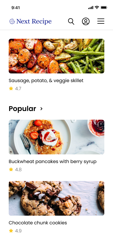
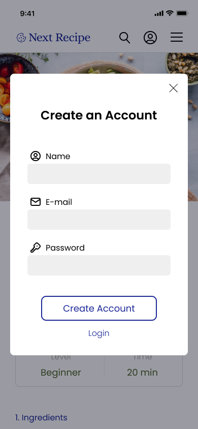
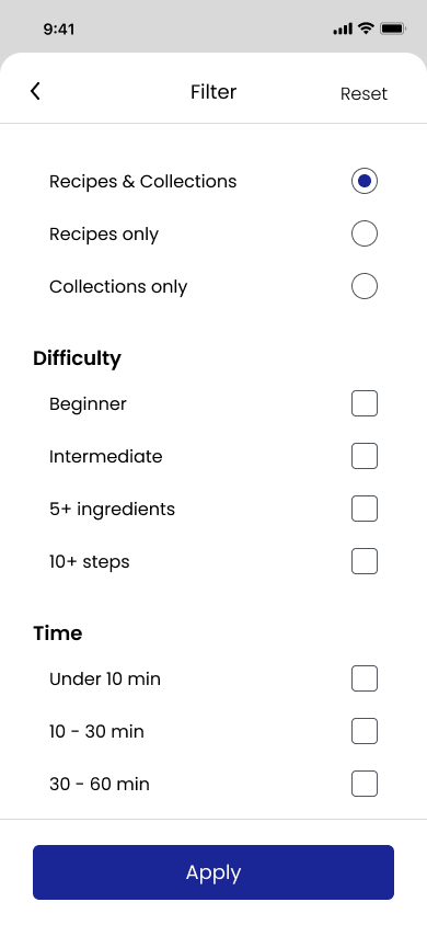
Final Mockups
I applied the style guide and UI elements to my wireframes to design final mockups for mobile screens. I also made presentation mockups of the responsive designs displaying the customized alignments and formatting done for the various screen sizes to ensure a consistent experience across devices.
Mobile


Responsive

